- Blog
- Touring ArtPrize 8: How Art & Venues Interact
Touring ArtPrize 8: How Art & Venues Interact
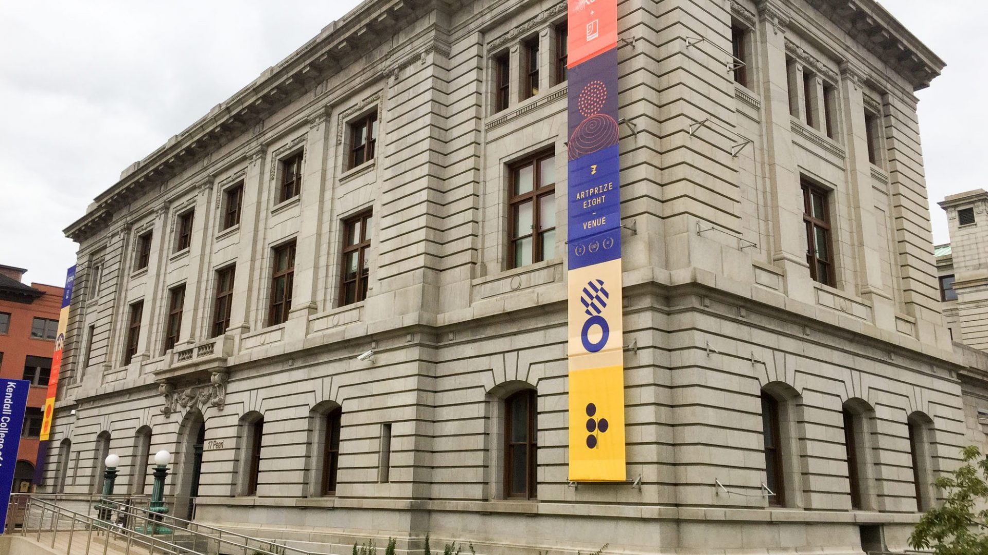
Planning one last trip to ArtPrize before the competition closes this weekend? As always, the event and its hundreds of installations offer much to see, experience, understand, and grapple with. The unique opportunity to personally engage with the art — alongside tens of thousands of others — is one of ArtPrize’s best and most unique features. But with all the pieces to see, have you given much thought to the venues that house the art? Sure, we may map our routes from DeVos Place to the Grand Rapids Art Museum to the UICA, eager to view the major pieces in each of them. But once we arrive, we may be more focused on specific pieces than the big picture plan, and how the pieces interact with the interior architecture and design. In this blog post, three Custer designers reflect on a number of installations and how each piece interacts with its venue. Keep reading for a unique perspective on some of ArtPrize 8’s grandest installations!
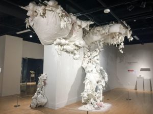 Piece: Cumulus
Artist: Daniel Bare
Venue: Kendall Federal Galleries
Heather Harrington, Interior Designer: The fantastic thing about the Galleries at the KCAD Federal building is that that you are able to truly use the walls and floors as your canvas. The same can be said about the exposed ceiling in this case. The artist used all planes in the space to his advantage and was able to create an incredibly dimensional piece of art. Despite the fact that he’s taken away almost every aspect of color from the composition, you are still familiar with the objects and they are seen as part of a bigger picture. While the white finish allows the installation to sort of lose itself within the wall, the black ceiling allows the installation to contrast from its background.
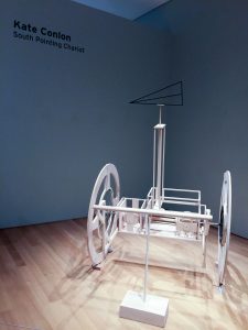 Piece: South Pointing Chariot
Artist: Kate Conlon
Venue: Grand Rapids Art Museum
Alex Genzink, Interior Project Designer: The GRAM’s minimal style allows this stunning piece of work to take center stage. Here, the piece takes on that same minimal quality instead of contrasting it. The monotone scheme of the piece ties in with the understated materials within the surrounding area. In contrast, the sculpture represents research, scientific investigation, and travel which are all very detailed, dynamic and forceful subjects, so the understated aesthetic balances the heaviness of what the sculpture represents. The irony here is the fact that the sculpture is located in a corner, which means there are limited directions of travel. This could also reinforce the artist’s point of “reminding us of our futility and insignificance in the universe.”
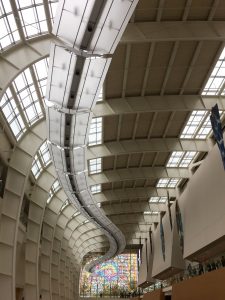 Piece: Carpet of Promises
Artist: Roman Minin
Venue: DeVos Place
HH: This entry is interacting with the interior elements of the space because of the natural elements outside of the structure. With the opacity of this installation, the artwork is able to play off of many materials surrounding it while the sun shines. Because of their light colors, the architectural finishes are able to absorb or reflect the vibrant colors of the piece, which results in the beautiful colors strewn across the room. If it weren’t for the installation on the windows of the building, along with the opaque quality of the materials used within the installation, you would only be able to experience the art from a direct view. But because of the light transfer, you could be looking in the opposite direction, or at another ArtPrize entry, and still be encompassed in the “Carpets of Promises” installation. The scale of this piece compliments the structure of Devos Place so perfectly. The open concept and height of the space can make you feel overwhelmingly small when the space is empty of color, vibrancy, and substance, even despite the beautiful architectural features. With one work of art, the artist was able to add a vast amount of warmth to the space, and all through color.
Amanda Price, Interior Designer: There is a lot of obvious movement and design elements here with the architecture. The architecture from this view leads your eye over to the window installment, however the scale and color of the piece is eye catching from any view. Also, the use of color in a neutral space really contrasts and spreads color from light coming through the window. The spread of colored light is almost like an extension of this piece.
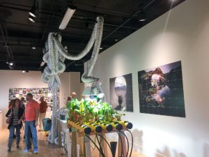 Piece: PlantBot
Artist: Jeff Schmuki & Wendy DesChene
Venue: Kendall Federal Gallery
AP: The first thing that comes to mind with this ArtPrize piece is the green story. This is a piece speaking to an importance of green life, while this building is a historic preservation remodel and LEED certified. I know that this building was a post office and library in its previous lives, which speaks to “growth” and life cycle.
HH: One of my favorite things about the KCAD Federal building is this whole concept that the historic preservation of the building is what shelters KCAD’s art students. The beauty of historical preservation is that in order to restore a structure like this, you must restore it to its initial, historic significance. While this doesn’t always allow for much interaction with new design trends, this specific site interacts daily with users whose primary focus is to project creativity at all times. This creates the perfect environment for ArtPrize, because the galleries allow you to use every inch as you wish, just as the artists of the “PlantBot” did. The artists used the ceiling to suspend elements of the project, while also connecting those same elements to features stabilized on the ground. The walls are utilized for photography correlating with the project, in showing their process and to help the viewer comprehend the project intentions. The artists provided interactive opportunities for the viewer as well, allowing them to participate in the art piece. This installation takes up a good amount of real estate in the galleries, and in doing so it makes you feel like you were a part of the production.
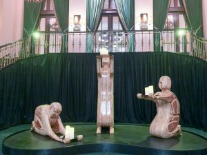 Piece: The Gift-Givers
Artist: Kroeze Krew
Venue: Amway Grand Plaza
AG: The dark backdrop provides high contrast and allows The Gift Givers to stand out from the otherwise intricate interior details. What’s more, the balcony behind the piece provides a literal higher level as suggested by the piece. The medium of the piece (wood) is a timeless material that transcends many interior styles, and the juxtaposition of simplified forms and the intricate details of the building provides balance.
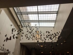 Piece: The Butterfly Effect
Artist: Pettit Smith
Venue: DeVos Place
AP: The skylight definitely is a key factor with this installation. I don’t think it would be the same without it. The light and transparency gives an airy feel and sense that the butterflies may either be flying out or flying in. There is a lot of movement here.
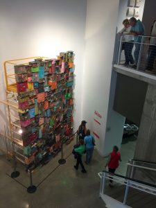
Piece: One Thousand Shacks
Artist: Tracey Snelling
Venue: Urban Institute of Contemporary Arts
AG: The location of this ArtPrize piece allows for viewing from multiple sides and heights, and the white wall provides a simple backdrop for the highly detailed piece. It also allows sound to bounce off the wall. I don’t know if this piece was placed in the UICA for this reason, but the venue is located along Division, which illustrates a lot of what the sculpture stands for – social issues, struggling to survive, and, as the artist put it, “the full experience of humanity – the good, bad and in-between.”
Visiting ArtPrize this weekend? Share your thoughts on the pieces, venues, events and more in the comments below!
