- Blog
- Celebrating Pantone's Color of the Year: Greenery
Celebrating Pantone's Color of the Year: Greenery

By now it’s certainly safe to say it: spring has sprung. The birds are chirping, rain and sun are in the forecast, and we’re slowly daring to show our ankles again. And as spring dawns all around us, the world is turning colors—greenery is sprouting from the soil, tree branches, bushes and beyond. Beautiful as spring’s lively green is, it’s no wonder that Pantone selected Greenery for their 2017 Color of the Year.
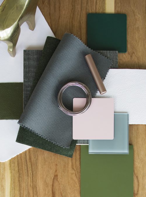
The color called Greenery (PANTONE 15-0343) is a shade in between lime green and forest green, is easy on the eye, and blends well with nearly every other color scheme (similar to real plants). Pantone even calls the shade “nature’s neutral.”
Why Greenery?
Every year, the color-matching company selects one color that embodies the current cultural moment of design. This year, Pantone’s selection of Greenery represents both the trend toward sustainable spaces as well as “the reassurance we yearn for amid a tumultuous social and political environment,” said Leatrice Eiseman, Executive Director of the Pantone Color Institute.
“Satisfying our growing desire to rejuvenate and revitalize, Greenery symbolizes the reconnection we seek with nature, one another and a larger purpose,” Eiseman follows.
As we know, that reconnection can happen within the walls of the workplace as well. And more and more, we are seeing a trend toward interior environments that encourage wellbeing of the mind and body, improved all the more with intentional color selection. Read on for inspiration on how to incorporate soothing green hues throughout your workspace.
Greenery in office spaces
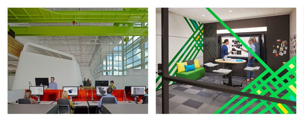
In the photo on the left, the green ceiling beams create a canopy over the workstations, adding intimacy back into the gaping open space. Drawing the eye upward, the green elements can also symbolize rejuvenation of the mind and offer perspective for those working face-to-face with screens.
In the photo on the right, the green elements draw the eye in all directions; and with this space being an Ideation Hub, that could be exactly the idea. The crossing lines symbolize ideas intersecting, dividing, expanding, and multiplying in the development phase. With green symbolizing renewal and energy, idea-generation is right at home in this room.
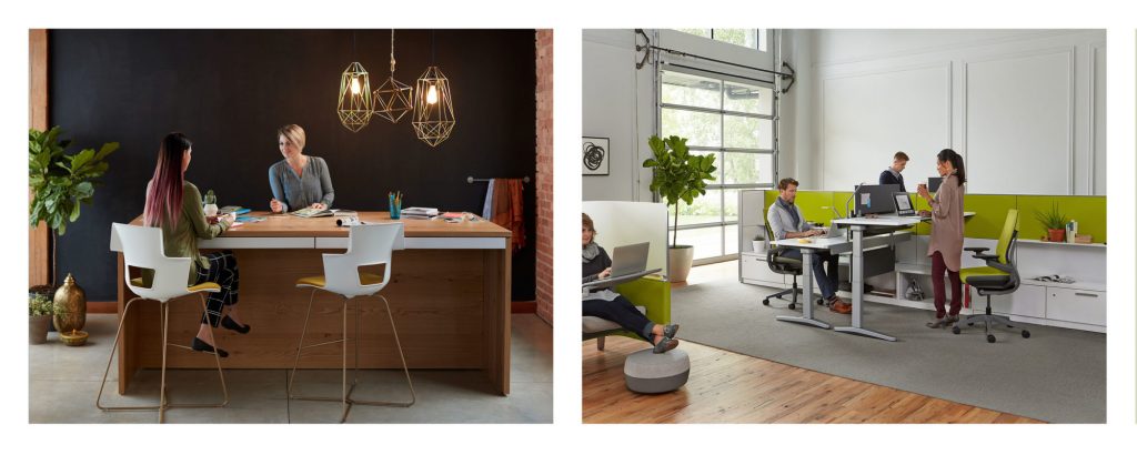 Greenery doesn’t always have to be bold to be seen—or felt. Left, a large leafy plant brings balance and a sense of fullness to the corner of this room, adding texture and dimension to an otherwise flat array of planes around it.
In the photo on the right, the yellowy-green fabric on the panels and seating gives the eye a place to rest among all the white in this office. The green also mirrors the bright and cheery light coming through the garage door.
Greenery in healthcare spaces
It’s amazing what a little bit of green can do to humanize a clinical space. According to Jackie Jordan, director of color-marketing for Sherwin Williams, “cool colors tend to be more calming, so things that are in the blues and the blue-greens…really put people at ease because they do bring a sense of tranquility.” In both of the above photos, green elements add a sense of comfort to both the waiting area and the exam room.
Greenery in education spaces
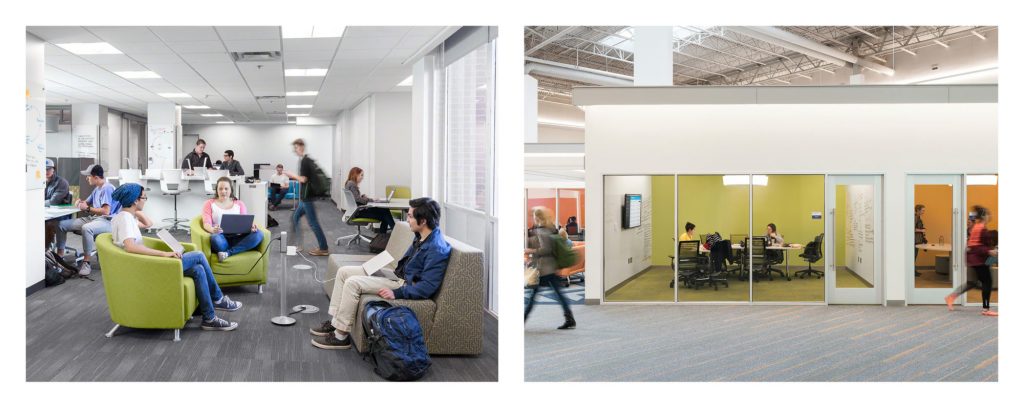
The education spaces above use green to varying degrees, but both show a retreat among a larger space. On the left, the comfortable armchairs are wrapped in green fabric, offering plush seating that is relaxing both physically and psychologically. What’s more, the space creates moments for reconnection to other students, technology, and the broader community around it.
On the right, this closed-off working room offers a place to retreat. With green symbolizing renewal and growth, the green shades in the carpet and on the walls bring a sense of calm beyond the busy corridor.
Have you incorporated Pantone’s color of the year into your workspace? Share with us on social media and tag @custerinc!
