- Blog
- 3 Ways to Incorporate Branding into Your Workplace Design
3 Ways to Incorporate Branding into Your Workplace Design

So you’re a director. Or an executive. Or a manager. Basically, you’re in charge.
You’re probably thinking about your organization’s brand: the perceptions, stories, and statements people make about you; the quality of your product or service; and your presence (or absence) in various community circles. Sound familiar?
One critical way to support your brand is through the interior design of your work environment. Of course, whether your workplace is inviting, supportive, clean, open, and well-lit are all reflections of your brand as much as they are reflections of your values. But you can also support your brand by bringing your logo, colors, and messaging within the walls of your workplace. Here, we share three ways to do just that!
1. Signage that shows who you are
Experience Grand Rapids wants you to do just that: experience Grand Rapids. With a visitor’s guide for every interest under the sun, the bureau provides all the information you need to make the most out of the city. The playful we-have-it-all brand represents Grand Rapids’ growing tourism industry and all that makes the city unique.
When it comes to Experience GR’s workspace, the idea that Grand Rapids is unique, upbeat, and accommodating to all comes across throughout. As is fitting, the visitors’ bureau makes a strong statement with their welcome area. Behind the custom reception desk are magnetic shadowboxes with an array of employee photos —right from the start, visitors can see that people are behind the best things that Grand Rapids has to offer.
The welcome area also features a custom brochure display, cut in the shape of the Grand Rapids skyline on the river. Subtle but certainly a statement, this piece and all of the materials it holds communicates Experience GR’s knowledge of and commitment to the city.
2. Statement pieces that say it all
When West Michigan Eyecare Associates moved into a new location earlier this year, they were keen on blending the 66-year history of their brand with its bright future.
Active on social media, WMEA posts cheerful updates on their office staff, volunteer hours, and helpful eye health tips. Bringing this spirit into their new workspace, a swinging eyeglass-shaped door was custom-built for the kids’ zone, and eyewear decals on the glass encourage photos for social media posting. With these brand elements, patrons are encouraged to touch, feel, and engage with the brand both physically and socially.
3. Colors that artfully communicate
When you think of Huntington Bank’s brand, what do you picture?
If you’re thinking of their signature lime green color scheme, you’re not alone.
Featured prominently in and on each of their banking locations, this specific shade of green has come to embody the Huntington brand. While green is the color of money — fitting for the brand of a large regional bank — this particular shade is a bright, upbeat tone that is distinct from darker, stuffier shades.
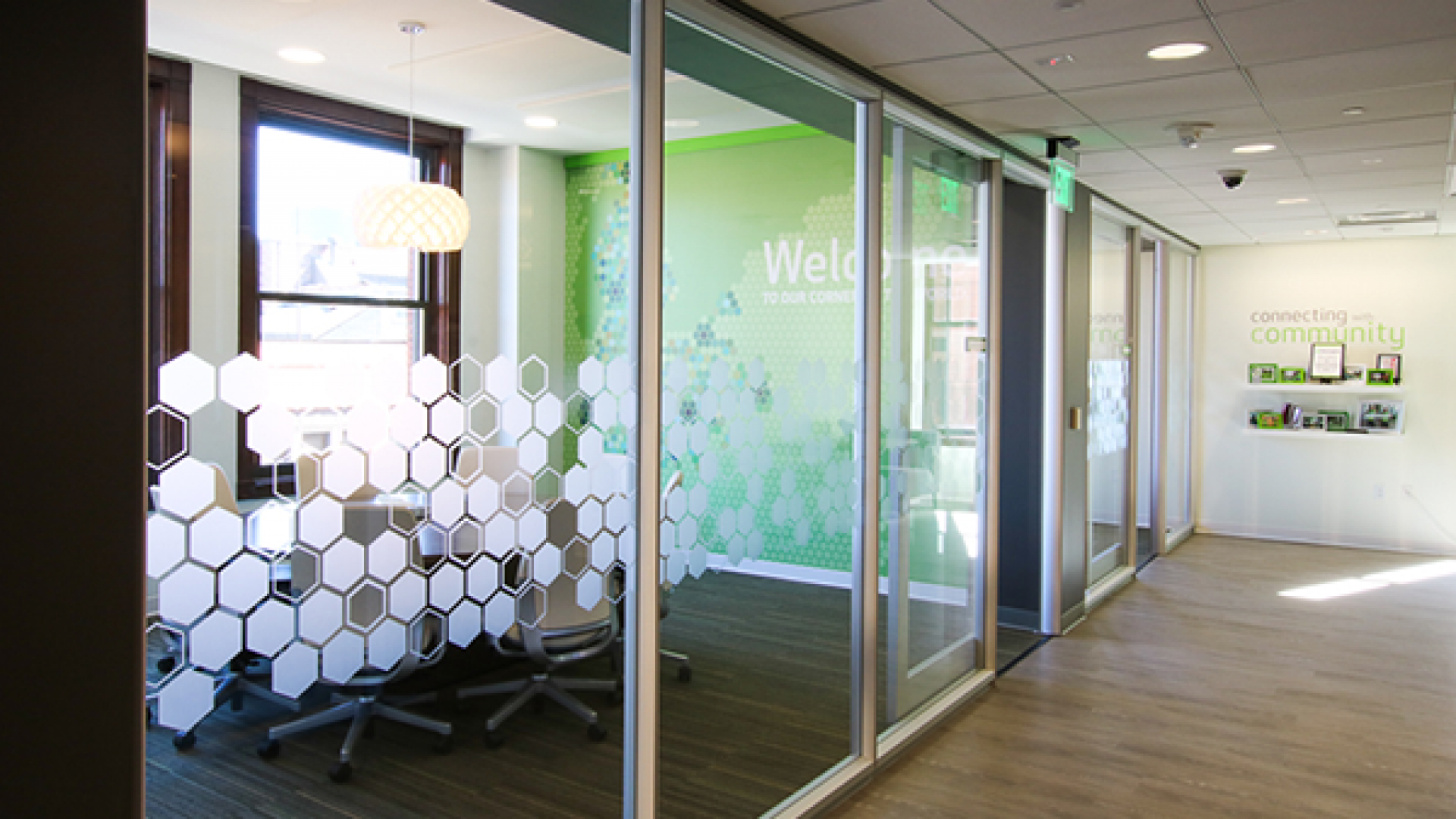
In Huntington’s downtown Grand Rapids office, the lime green brand comes to life. Playing prominently in the fabrics, finishes, paint colors, artwork, and accessories, the brand colors are loud and clear.
What’s more, Huntington’s more subtle brand features, such as bright orange and honeycomb pattern, are used as accents throughout the space. The result is a work environment that exudes the Huntington brand in a fresh and eye-catching way. You don’t tire of seeing the green when it’s applied artfully.
How do you bring your brand into your workspace? Share with us in the comments below!


